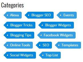
 Customize a labels in blogger brings beauty to the blog. It make our blog beautiful and more attractive. We know that by defaults blogger cloud labels widget looks very ugly, but if we add some a piece of code to the the style sheet then it become a eye catcher for visitors and readers. Mostly this widget is appeared at right side of blog which consist of several of topics. So today in this post i will present a beautiful blue color label widget which have implemented on TBT since from a long. So this article is about how to customize blogger labels widget. This widget helps you a lot to show a related topic or related post with a single click. So we could find a desire label to view all the posts of related topics. In this way we can find a multiple posts of a same topic with a single click.
How To Customize Labels Widget In Blogger ?
- Login to blogger dashboard.
- Goto template and click on Edit HTML.
- Find this ]]></b:skin
- Paste the following code just above/before ]]></b:skin
.label-size{
margin:0;
padding:0;
position:relative;
}
.label-size a{
float:left;
height:24px;
line-height:24px;
position:relative;
font-size:12px;
margin-bottom: 9px;
margin-left:20px;
padding:0 10px 0 12px;
background:#0089e0;
color:#fff;
text-decoration:none;
-moz-border-radius-bottomright:4px;
-webkit-border-bottom-right-radius:4px;
border-bottom-right-radius:4px;
-moz-border-radius-topright:4px;
-webkit-border-top-right-radius:4px;
border-top-right-radius:4px;
}
.label-size a:before{
content:"";
float:left;
position:absolute;
top:0;
left:-12px;
width:0;
height:0;
border-color:transparent #0089e0 transparent transparent;
border-style:solid;
border-width:12px 12px 12px 0;
}
.label-size a:after{
content:"";
position:absolute;
top:10px;
left:0;
float:left;
width:4px;
height:4px;
-moz-border-radius:2px;
-webkit-border-radius:2px;
border-radius:2px;
background:#fff;
-moz-box-shadow:-1px -1px 2px #004977;
-webkit-box-shadow:-1px -1px 2px #004977;
box-shadow:-1px -1px 2px #004977;
}
.label-size a:hover{background:#555;}
.label-size a:hover:before{border-color:transparent #555
transparent transparent;}
- Click on the save button and you done it.
 HOME
HOME

0 comments :
Your feedback is always appreciated. We will try to reply to your queries as soon as time allows.
Note:
1. Make sure to click the "Subscribe By Email" link below the comment to be notified of follow up comments and replies.
2. Please "Do Not Spam" - Spam comments will be deleted immediately upon our review.
3. Please "Do Not Add Links" to the body of your comment as they will not be published.
4. Only "English" comments shall be approved.
5. If you have a problem check first the comments, maybe you will find the solution there.
Post a Comment